Our new and improved Email Designer makes it easier to create branded, high-performing emails within the platform.
With an emphasis on reliability and an easy-to-navigate UI, this email designer will give you the best possible experience to create optimal campaigns and engage your prospective students and constituents.
Take Note
- The Email Designer will be accessible through the standard campaign workflow in both the Campaigns and Automations sections. You can create an email from scratch by selecting "Standard" or "Automated" as your campaign type after clicking on "Create a Campaign" in the Campaigns section. Additionally, you can access the new designer by creating an Automation and adding an email.
- If you start with the new designer, you cannot switch to the legacy designer within that same campaign. Instead, you’ll need to create a new campaign using the legacy designer.
- Throughout the email designer, you can utilize the colors from your Brand Kit in the color picker.
Using the Email Designer
To create campaigns using the Email Designer, you utilize tools called Structures and Blocks. These design tools are listed in two distinct sections in the main side menu: Content and Global Settings.
Email Designer Content Menu Options
The Content tab in the Email Designer helps you build the structure of a campaign. This includes
- Structures (with Containers)
- Blocks
A Structure is a draggable element used to create various content blocks in your campaign. You can add as many Structures as you need for your design.
Each Structure contains a specific number of Containers. You can choose a Structure with 1, 2, 3, or 4 Containers. These Containers enable you to utilize multiple campaign functions within a single content block. For instance, you can insert a Structure with 2 Containers into your campaign, using one Container for a text box and the other for an image file.
You can configure the sizing and general appearance of individual containers within a structure by clicking on “To Structure” option near the top of the side menu:
When you click that option, you will see a new menu appear:
You can adjust the indentation and padding for each container in this section.
By clicking on “To Container” at the top of the side menu, you can access options for the entire campaign. After placing your desired Structures in your campaign, you can start filling them with specific blocks.
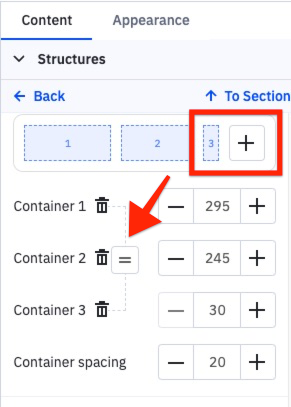
If you want to add another container to a structure, click the plus sign in the top right corner. After adding the container, you can easily resize it to match the other containers by clicking the equal (=) button.
A Block represents the type of content to include in your campaign. The following are the types of blocks you can use to design your campaign:
- Image
- Text
- Button
- Spacer
- Video
- Social
- Banner
- Timer
- Menu
- HTML for custom code
To learn more about the newest Block options – Banner, Timer, and Menu – please visit Email Designer Blocks Explained.
Once in place, you can click on each of these elements to customize them with colors, font sizes, links, etc. You need to drag and drop it to your template and then edit it to use any of them.
The Email Designer Global Settings Menu Options
In the Global Settings tab, you can edit your structure elements. You will find the following editing sections under the Global Settings tab:
- General Settings
- Sections
- Headings
- Button
- Mobile Formatting
Each of these sections further customizes the style of your campaign.
General Settings
Under General Settings, you can adjust things like message width and font. Here’s a complete list of possibilities:
- Message width. The default width is 600px, but you can set any size between 320 and 900px.
- Default padding. A default padding for all new structures is added to email campaigns from the Content tab by default.
- Background color and image. Set your preferred background color and image based on your email content.
- Font. Use your preferred font.
- Line and paragraph spacing. Set your spacing preferences between text lines and paragraphs.
- Underline links. Choose whether you’d like your links to appear underlined or not.
- Responsive design. Enabling this function may help to improve the mobile version of your campaign. However, results may vary on different devices. If this function is turned off, the mobile version of your campaign will mirror the desktop version.
- Right-to-left (RTL) text direction tab. If this control is activated, text direction will automatically go from right to left.
Sections
The Sections menu controls your Header, Content, Footer, and Info rows. Within each sub-sections, you can customize the Text Size, Font Size, and Link Color.
Headings
You can set the default font style, size, color, bold, and italics fonts for H1, H2, and H3 headings.
Button
The Button menu allows you to set some parameters that will be used for all buttons in the email by default.
You can customize button settings like color, font, border, etc. Note that configuring the settings under this section may prompt additional menu options.
Mobile Formatting
To create a mobile-friendly version of your campaign, use the mobile formatting options. These settings will only work in the mobile version of the campaign.
For mobile viewing, you can configure:
- H1, H2, and H3 sizing
- Button text size
- Button width
- Content margin
Questions?
Contact us via chat today.